knowledge
from the Artist
knowledge
from the Artist
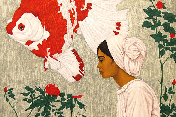
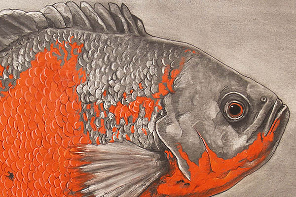
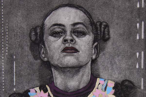
Immerse yourself in a world of inspiration for creative minds and literature enthusiasts. Explore a variety of color information, discover recommended books that pique your curiosity, and enjoy informative short films that engage your senses. Here, you will find a diverse collection that ignites your artistic spirit and deepens your love for stories. Allow yourself to be inspired by this rich source of stimulating content and dive into the fascinating world of art and literature.
Stories about colors

Michael Harding: “Miracle Medium” – biodegradable diluents
In a candid conversation with Michael Harding, the visionary behind the eponymous brand renowned for its oil paints and art supplies, a spotlight falls on his latest innovation – the “Miracle Mediums.”
Harding’s recent investigations have unearthed a profound revelation regarding the long-term impact of traditional solvents on oil paints. Delving beneath the surface with microscopic precision, it becomes evident that linseed oil comprises a delicate chain-like structure. Introducing conventional solvents disrupts these chains, resulting in a gradual diminishment of color vibrancy over time. Yet, the burning question remains: do these chains reassemble post-solvent evaporation and paint drying? Harding elucidates that while they do regenerate, they do so in truncated forms, signifying an alteration in color attributes and heightened susceptibility to temporal degradation.

The Color Black: History and Essential Differences between its Manufactured Shades.
Claude Monet wrote in his memoirs that he used to paint outdoors with John Singer Sargent. Singer Sargent asked Monet for his paint box. Monet knew the two words he would hear when Singer Sargent saw the box. Indeed, Singer Sargent did not find any black paint in the box, and it was a dark day for Monet.
Firstly, it’s important to know that there are four shades of black produced by companies, as well as other similar shades, but let’s focus on the most famous shades of this color.

Prussian Blue – The Story and History:
There are many stories about the discovery of this blue color, but the most accurate and closest to the truth is the one mentioned by the German doctor “Georg Ernst Stahl”, born in 1659, who recounted and said:
There was a pigment maker in Berlin named Diesbach who was producing a series of red pigments using some insects and chemicals, including potassium. When he ran out of potassium, he went to a pharmacist named Johann Conrad to buy a new quantity of potassium. However, for some unknown reason, the pharmacist sold Diesbach contaminated potassium tainted with dried animal blood. Why he did this, nobody knows.

Why do we call it French ultramarine?
Let’s hear the story.
The color ultramarine was discovered before the nineteenth century, extracted from the blue lapis lazuli from Afghanistan. It was almost the most expensive pigment in the world. Grinding a whole kilogram of stone would produce only 30 grams of the color pigment. Artists restricted its use to garments of sacred figures and used it very sparingly. Moreover, the cost of using ultramarine was billed separately from the artist’s fee for the painting. Anyone wanting to create a painting with this color had to bear the cost of the amount of pigment used. The term ‘ultramarine’ in Latin means ‘beyond the seas,’ referring to the distant land of Afghanistan, far from Europe, where the pigment was extracted. Until a French chemist named Jean Guimet came along and prepared the color in a laboratory by adding some chemical elements to it, extracting a more vibrant blue than the original pigment.
Hence, the name ‘French ultramarine’ was given to this blue color, which remained widely used and became a staple in artists’ palettes worldwide.
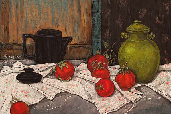
علي حسان

“Carmine red color is considered one of the most expensive shades of red, and it is extracted from the cochineal insect dye. You should know that there are thousands of living organisms that sacrifice their lives for you to paint.”
علي حسان
Carmine is a red dye derived from the dried and powdered scale insects of the female cochineal scale (Dactylopius coccus). Also known as carminic acid or E120, this dye is widely used in the food industry and cosmetics.
The female cochineal scale insects reside on cactus plants, feed on plant sap, and excrete a red fluid known as carmine. These insects are harvested, dried, and finely ground to extract the dye. The chemical structure of carmine primarily consists of carminic acid, a natural dye belonging to the anthraquinone group.
In art, carmine holds particular significance due to its intense red color. The transparency of carmine pigments allows artists to achieve vibrant effects, and its mixability enables the creation of a wide range of shades when combined with other colors. The high colorfastness ensures that artworks do not fade over time. Artists can employ carmine in various mediums such as watercolors, oil paints, and acrylics for versatile artistic expression.

The rest of the colors manufactured from very expensive pure oxides.. Gamblin collects them every year and mixes them together in the spring and produces a limited number of limited edition tubes of a degree of gray different from the usual gray and named it Torrit Gray
The beautiful thing about this color is that every year with the difference in the rest of the colors collected in the factory, the shade of gray will be different from each year, and the company announces that every year it will use a color that is not repeated at all.. Greetings to all art makers and everything related to its production
علي حسان
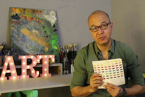
Ali Hassaan had been preoccupied for years with how to adapt artistic material to achieve the best possible result.
This gave him the idea of a “art in a minute” show presented in episodes on social media. “It was to be a short educational programme to deliver an intense burst of information for those interested in the technical aspect of producing art, in various styles and with whatever colours they use. I tried to be brief since the largest section of my audience are art college students.”
Hassaan explained: “The technical aspect is what keeps paintings alive longer, so they can be shared across generations.” “The originality of traditional crafts from ancient Egyptian art up to our time is about the quality of techniques and work materials,” he added. “No matter how wonderful the painting is, it will soon be threatened with rapid damage, if its creator uses poor materials, or the wrong colour mixes. It thus loses its eternal value and continuity, two essential qualities of any original artwork.”
علي حسان
Art in a minute
Arabic with English subtitles
Art lessons from the artist.
A short informative program for everyone interested in the technical aspect of art production in different styles and colors. The correct method of using art materials and techniques.
What is “Art in a Minute”
“Art in one minute” conveys information about art in 60 seconds. Make it as simple as possible to make it memorable. Everyone can understand it and remember it easily. …
The two different varieties of fixative sprays.
Fixative sprays are intended to “hold” (fix) the color pigments on the image carrier.
In the first part of “Art in a Minute” Ali Hassaan explains the two different types of fixatives and presents different products.
Use of fixative spray.
Drawings made of pastel chalk, natural charcoal and charcoal, pencils and colored pencils should be fixed.
In the third part of “Art in a Minute” Ali Hassaan shows us how to properly use a fixative spray.

In his book on British Impressionism, the writer Kenneth McConkey presented a very important information that people neglect in classifying the Impressionist style as a technique.. The writer explained that the method of implementing the painting is through close brushstrokes in the form of a comma (,) punctuation mark. It is a technical style, and a painting executed in this way cannot be described as an impressionist painting. He emphasized that the correct definition of impressionism is to seize the impressions of sunlight on the elements or external nature and use the luminous color palette that distinguished the impressionists.
Far from the important information, the book is one of the best books that captures an unfamiliar aspect of the Impressionist school, which is the work of the artists of London, Scotland and Ireland.
SKU: GOR001921539 – ISBN: 139780714829562 – ISBN: 100714829560
TITEL: British Impressionism – Kenneth McConkey – AUTOR: Kenneth McConkey
VERLAG: Phaidon Press Ltd – ANZAHL DER SEITEN: 160
علي حسان